Here you will find details about available field types:
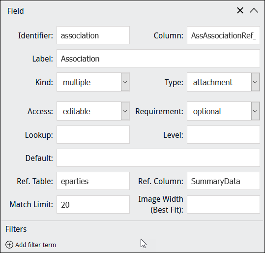
When an attachment field is specified in Column, a user is presented with a text box; when a value is entered in the text box, a search is performed in Ref. Column in the target![]() An attachment is made from one record to another. The record from which the attachment is initiated is the Primary record; the record that is attached is called the Target. module (Ref. Table) and matching results are listed (up to the number specified in Match Limit) from which the user can select a record. On saving the Form, an attachment is made from Column to the record selected in the target module (the IRN of the attachment record is saved in Column).
An attachment is made from one record to another. The record from which the attachment is initiated is the Primary record; the record that is attached is called the Target. module (Ref. Table) and matching results are listed (up to the number specified in Match Limit) from which the user can select a record. On saving the Form, an attachment is made from Column to the record selected in the target module (the IRN of the attachment record is saved in Column).
When an attachment field is specified in Column:
- The table to which it attaches is automatically specified in Ref. Table, and Ref. Column is set to SummaryData; a default number (20) is added to Match Limit.
- It is possible to specify a Filter to restrict which records are returned by the search of the target module.
In this example, users will be presented with a field that attaches to the Parties module:
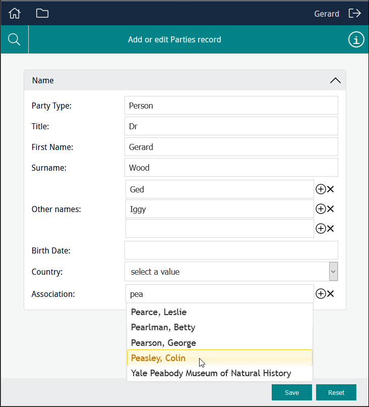
As letters are entered into the field, records are progressively filtered and all matching records in the Parties module will be listed:
When the user selects an entry in the list and clicks  , the attachment is made to a person or organization associated with the current Parties record (the attachment record's IRN is saved to Column).
When an attachment field is specified in Column:
- Type is automatically set to
attachment. - Ref. Table is automatically set to the back-end name of the table to which the attachment field specified in Column attaches.
- Ref. Column is automatically set to SummaryData. This is the column searched for a match when a user enters values in the Form. The column searched can be changed to any column in Ref. Table.
- Match Limit is automatically set to the default number of results (20) to display to the user. This number can be changed as required.
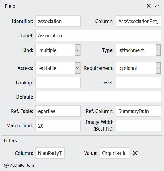
Rather than presenting users with all possible records in the Parties module, it is possible to add a filter that limits which records are returned when the user enters characters into the field.
To add a filter, click  and specify a Column and Value to restrict which records are returned when the user enters characters into the field. In this example, only records where Party Type = Organisation will be listed:
EMu (version 5.0 onwards): escaped double quotes are required around any value that includes a space, New Zealand for example, in order to match a value exactly. For example, to add a filter that will only list records for Parties in New Zealand, you would specify:
- Column =
AddPhysCountry - Value =
\"New Zealand\"
An api key is required to generate what3words encoded data. If this functionality is required, clients can obtain a key directly from what3words or request that Axiell generates a free key. Note that the free and paid keys provide different features, and the free key has a limit of 100 uses per month. The Axiell project delivery team will need to set the api key (what3words-key) in the config PHP file (config/local.php).
what3words is a proprietary geocode system designed to identify any location with a resolution of about three metres. The system encodes geographic coordinates (your device's latitude / longitude position) into three permanently fixed words. For example, the front door of 10 Downing Street in London is identified by slurs.this.shark1.
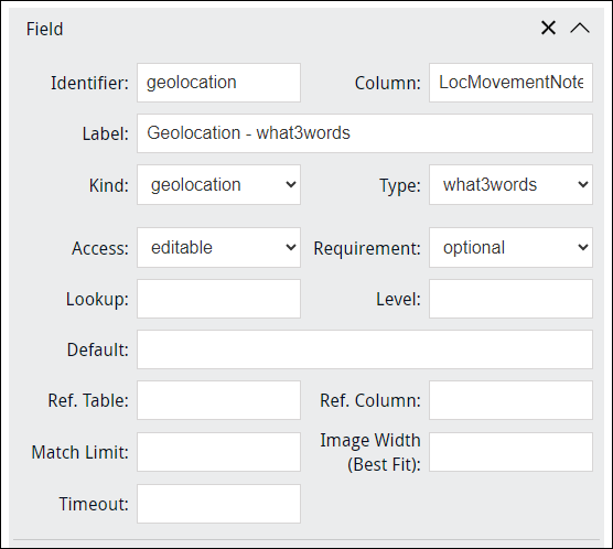
When a Kind of geolocation is specified, Type = what3words by default. As the data generated by a what3words field is text, we would generally point Column at a text field:
The user is presented with a read-only field with a Refresh button used to Generate what3words:
When the user selects the button, the precise geographic coordinates of the user's device are converted to three permanently fixed words:
Conceivable uses of the what3words geocode system include encoding geographic coordinates when out in the field collecting samples or perhaps recording the physical location of an item when performing a stocktake.
When a field is specified as having a Type of selection or Text and Column has an associated Lookup List, a user is presented with a list of read-only values drawn from Column.
Note: In order to display values from the Lookup List associated with Column, it is not necessary to specify the name of the Lookup List in Lookup.
The Lookup option is used:
- In conjunction with
selectionortextand Column.The back-end name of any Lookup List can be specified in Lookup in order to present its values to a user instead of values drawn from Column.
This would be useful, for instance, if Column includes a large number of entries and only a small number are required for the purposes of data entry.
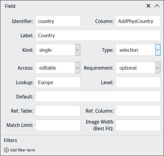
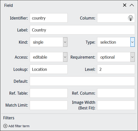
For example, AddPhysCountry is associated with the
LocationLookup List, but in this example the Form will include a drop list of values drawn from theEuropeLookup List. A value selected by the user will be saved to the AddPhysCountry column: - A Lookup List can be used in conjunction with the Annotate tool:
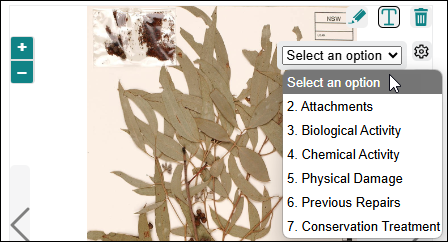
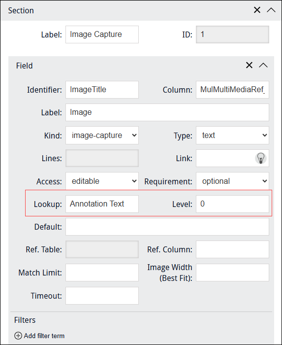
Reasons for annotating images can be defined in an EMu Lookup List and associated with the Annotate tool. Each option in the drop list has a specific colour and size, differentiating it from annotations for every other drop list option. In this example, annotations added when 5. Physical Damage is selected will have a different colour and size to annotations added when 6. Previous Repairs is selected.
If the Lookup List is a hierarchy (multilevel), the drop list can be configured to display more than one level; an entry is selected in the drop list and then a second (third, etc.) drop list will display:

Use the Level field to specify how many levels of a Lookup List hierarchy to present as a drop list. Enter
0to present all levels in the hierarchy: - Where no Column has been specified when using a Processing Script to perform some special processing.
Specify the back-end name of a Lookup List to present its values to a user. If the Lookup List is a multi-level hierarchy, use the Level field to specify which level of the hierarchy to present:
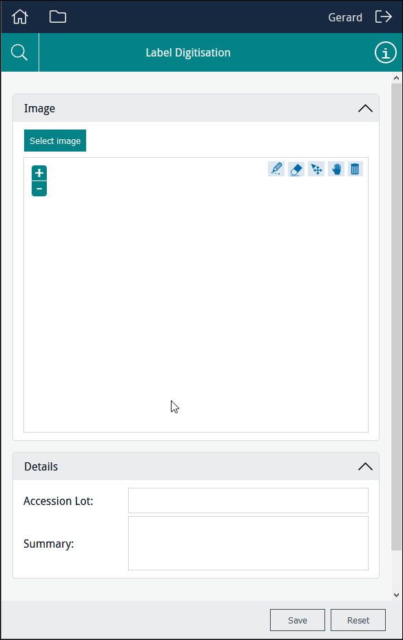
It is possible to display an image on a Form, and to enable users to upload multimedia accessible to their device, and to capture an image with their device and upload it.
Four image Kinds are available:
|
|
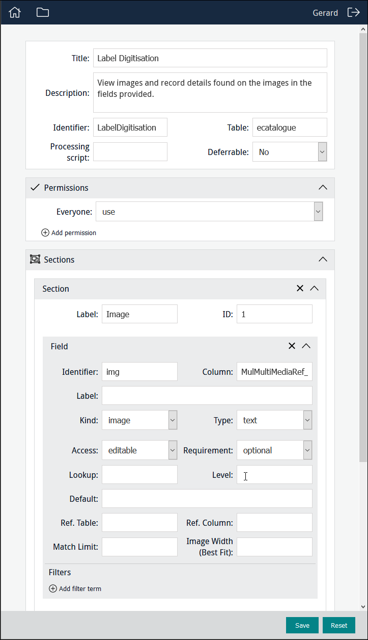
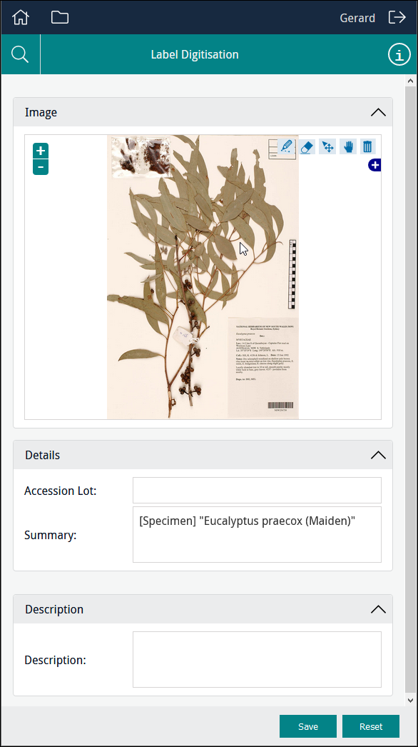
Display an image in a Form. A typical use might be to display a scan or other image which contains information that a user would locate and key in to other fields in the Form.
When specifying a Kind of When a Kind of Note: When adding an image control to a Form, it may be better to exclude a Field label in order to maximize the size of the image control. This is particularly important when using a custom layout with columns. In this example, Column points to MulMultiMediaRef_tab, a text field in the Catalogue module which holds details about images used during data capture, including:
The field which holds details about images used during data capture is populated with these details when an image is uploaded using Sapphire. See Kind: image-capture for details. Note: The field can also be populated with details about images using various back-end scripts. Having added an image to the Form, we could then add fields necessary to record any details available on the image: |
|
|
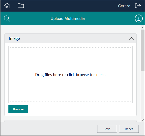
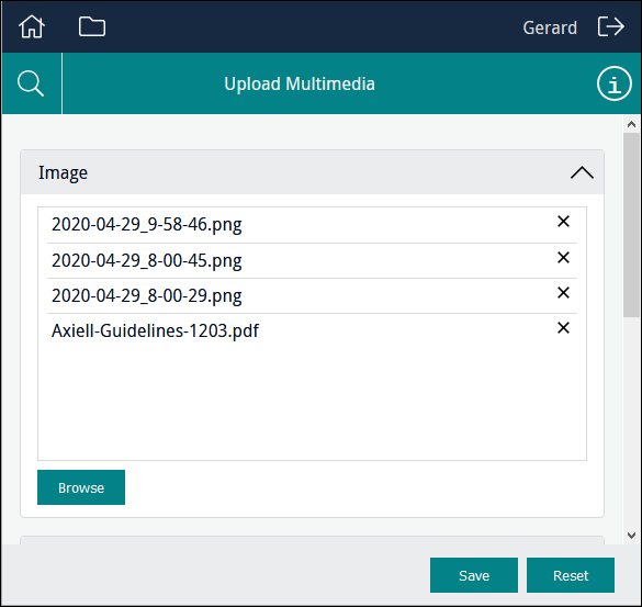
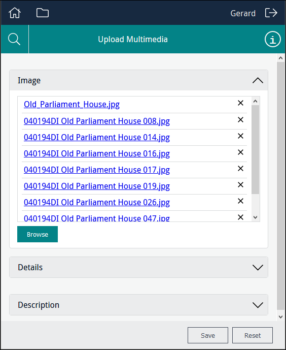
Enable users to locate multimedia of any kind that is accessible to their device and upload it. Note: When specifying a Kind of When a Kind of In this example, Column points to MulMultiMediaRef_tab, a text field in the Catalogue module which holds details about multimedia uploaded during data entry: Users can drag one or more files onto the control or click Browse to navigate to a file and add it to the control: A file can be removed from the list by clicking Note: The When the Form is saved, a record will be created in the Multimedia module for each of the uploaded files. When using a Form to create or edit a record, in the Catalogue module for instance, the newly created Multimedia records will be attached to the current record. If the Form allows users to search a module for existing records, any multimedia already attached to the record will be listed: Note: A multimedia resource listed in the Clicking |
|
|
Enable users to locate images accessible to their computer / device and upload it via the Form. Note:
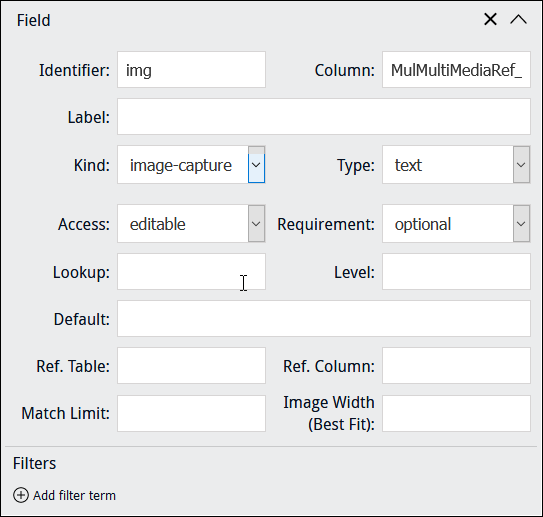
When specifying a Kind of When the record is saved, the image is uploaded to the EMu Multimedia repository and attached to the record being created (a Catalogue record in the example below). When a Kind of Note: When adding an image control to a Form, it may be better to exclude a Field label in order to maximize the size of the image control. This is particularly important when using a custom layout with columns. In this example, Column points to MulMultiMediaRef_tab, a text field in the Catalogue module which holds details about images captured during data entry, including:
Note: This field can also be populated with details about images using various back-end scripts. As with an |
|
|
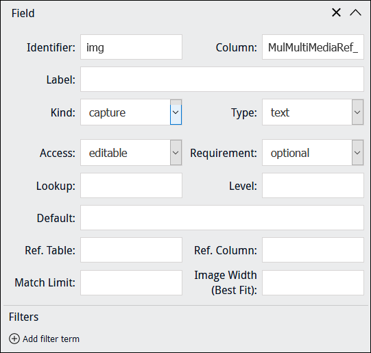
Enable a user with a mobile device to capture an image with the device's camera and upload it.
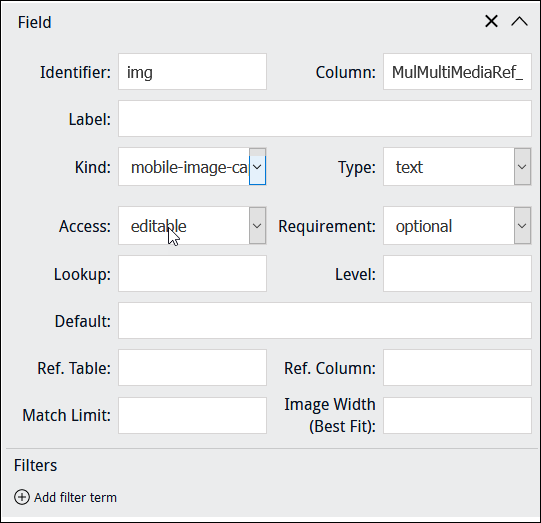
When specifying a Kind of When the record is saved, the image is uploaded to the EMu Multimedia repository and attached to the record being created (a Catalogue record for example). When a Kind of Note: When adding an image control to a Form, it may be better to exclude a Field label in order to maximize the size of the image control. This is particularly important when using a custom layout with columns. In this example, Column points to MulMultiMediaRef_tab, a text field in the Catalogue module which holds details about images captured during data entry, including:
Note: This field can also be populated with details about images using various back-end scripts. As for the other image kinds, we might include fields on the Form to capture any other details required at this stage of the workflow. |
|
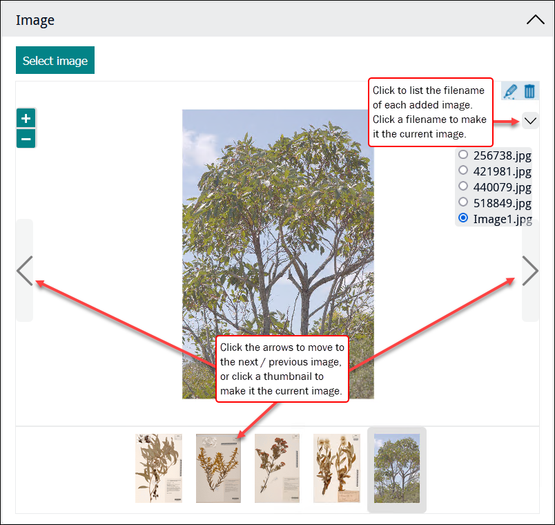
When more than one image displays in an Image control, the Image control functions as a (static) carousel that enables users to cycle through the images (details here)2: This default behaviour can be disabled by suitably authorized users by setting |
|
Keep in mind
You typically build forms that allow users to add or edit records in modules such as the Catalogue or Parties. On these forms you can include Multimedia fields and users will be able to add or remove attachments to Multimedia records. Note that this does not allow users to delete records from the Multimedia module. When users upload multimedia when editing Catalogue records, for example, this will create a record in the Multimedia module for the uploaded resource and attach that record to the record they are editing. A Form would need to be designed specifically for the purpose of editing records in the Multimedia module in order to alter Multimedia records themselves.
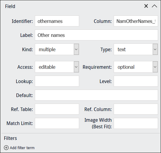
When a Kind of multiple is specified for a field:
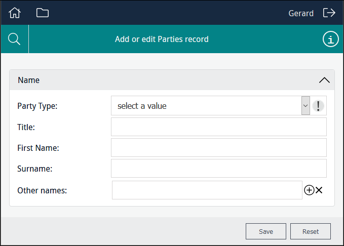
the user will be presented with a single data entry field in the first instance (Other names in this example):
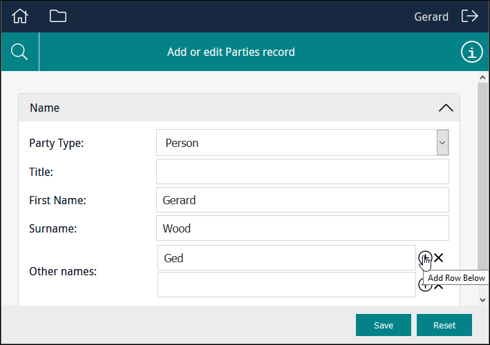
Clicking the Add Row  icon beside a row will add a row immediately below it:
Selecting the Remove Row  icon beside a row will remove the row.
Note: When the back-end name of a table of values is specified in Column, Kind is automatically set to multiple. In the example above, NamOtherNames_tab is the back-end name of the Other Names: (Person Details) field.
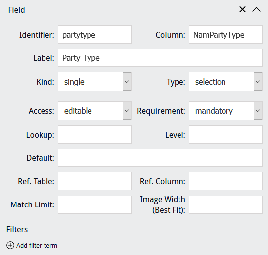
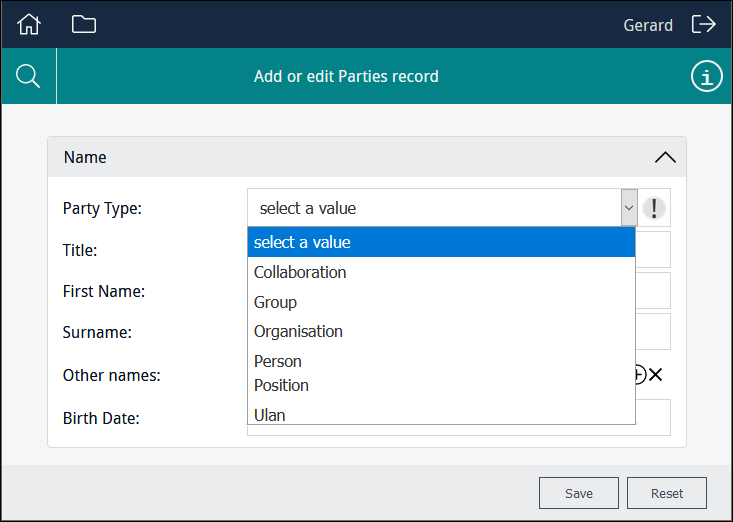
If Column has an associated Lookup List, selecting a Type of selection will present users with a read-only drop list of values drawn from the Lookup List associated with Column. For example, a field such as Party Type in the Parties module, which has the back-end name NamPartyType, has an associated Lookup List called Party Type. In order to display values from the Lookup List associated with Column, it is not necessary to specify the name of the Lookup List in Lookup:
You would specify a different Lookup List in Lookup if you wanted users to be able to select a value from a different Lookup List in order to save that value to Column.
In this example the user is able to select from a read-only list of titles drawn from the NamPartyType column:
Note: If a Lookup List is large, it might make sense to specify Type: text rather than Type: selection as Type: text filters the list of values presented to users as data is entered in a field, rather than displaying all available values in a drop list.
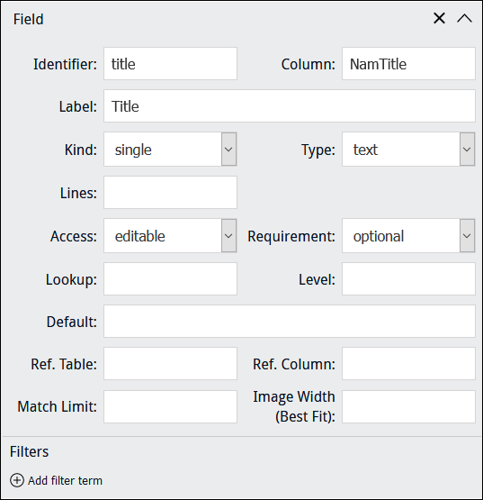
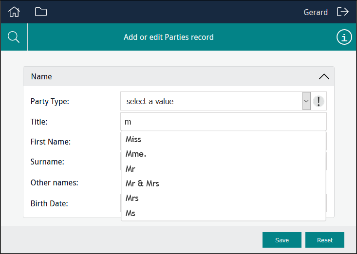
If Column has an associated Lookup List, selecting a Type of text will present users with a filtered read-only drop list of values drawn from the Lookup List associated with Column. Filtering occurs as the user enters characters in the field. For example, a field such as Title: (Person Details) in the Parties module, which has the back-end name NamTitle, has a Lookup List called Title:
Note: If the field specified in Column has an associated Lookup List, it is not necessary to specify a Lookup List in Lookup: the Lookup List associated with Column is automatically available to the Data Entry user.
In this example as the user enters characters in the field, a filtered read-only list of titles drawn from the NamTitle column is displayed:
You would specify a different Lookup List in Lookup if you wanted users to be able to select a value from a different Lookup List in order to save that value to Column.
Note: If a Lookup List is large, it might make sense to specify Type: text rather than Type: selection as Type: text filters the list of values presented to users as data is entered in a field, rather than displaying all available values in a drop list.
